Posts

Showing posts from January, 2022

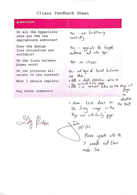
LO4: Client Testing Feedback

Image
3 Amends: I added an image carousel to my website using images I had taken.    I added a YouTube video to the days out page. I added a data protection notice.

LO4: User Acceptance Testing (Usability)

This is my usability testing. I asked Georgia to test my website and then I interviewed her in order to make sure that everything was working, that it was easy to navigate and that it was accessible.  L: What is your favourite aspect of my website and why?  G: My favourite aspect of your website is the overall house style along with the placement of your images. This is because I think it looks really professional and eye catching towards the users.  L: What was your least favourite aspect of my website and why? G: My least favourite aspect of your website was how there was no interactive videos on any page. This is because I would like to watch  something  that moves that showcases around Doncaster town.    L: Do you think that my website is suitable and appropriate for my intended target audience?  G: I  think  that your website is suitable and appropriate for your intended target audience because it appeals to all types of people such as the neutral yellow tones being used on some o

Optimising Photos

Image
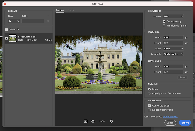
  I optimised my images to make the file size smaller in order to make my website run faster and smoother. This helps the users since they won't have to wait too long for the website to load and can therefore access it quickly. Originally the file size was too large at 1.4 MB so I changed it from a PNG to a JPG. After I changed it to a JPG, it was still a bit to big at 483.9 KB so I decreased the quality to 75% while still ensuring that the quality was good enough for my website. I managed to finally get it down to 289.7 KB which was small enough to then put on my website. The original size of this image was 356.1 KB as it was originally a JPG which is pretty small but still a little too big to put on my website. I ended up decreasing the quality to 90%. I decreased the quality to 90% which allowed me to get the file size down to 275.6 KB which made it small enough without compromising the quality drastically. I created my logo on the procreate mobile app. I created it on multiple

Gantt chart

Image
 

Colour Scheme

Image
For my website, I used the colours from the logo to create a unified page.