LO3: Justifying Interactivity Report
The interactivity elements I am planning to include are an image carousel with photos that I have taken and a video external links to maps.
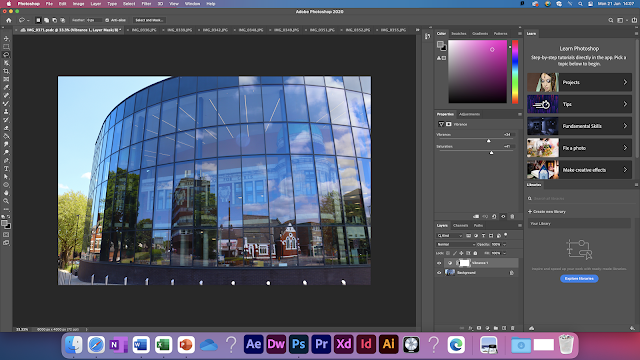
I will include images that I have taken of the savoy, the cast and danum gallery alongside copyright free images from either wix or pexels. I will do this to allow the users of my website to see the places that my website is talking about and also to make my site more appealing for the users. I will edit the photos that I took on photoshop to make them look brighter by upping the saturation and changing the vibrance and I will also remove some blemishes and other things like a yellow fence in an image of the gallery and some rubbish from the fountain in the cast picture. I will also edit one of the pictures at cast to make it darker to make it seem like it was night. I will do this by lowering the vibrance, exposure and contrast.
I added the interactive elements that I chose because the video shows the users what Doncaster is like, the images do the same whilst also making the website more appealing for my target audience and finally I added external links to maps and the websites of the companies so that people can look at their website to see in more detail what it is and also if that company requires a booking then they will have the website there rather than having to search for it themselves and then the maps so that they know where they need to go.
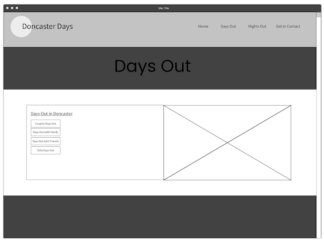
To appeal to my target audience I needed to use bright colours. This is shown in my mood board and my visualisation diagram. Since my site is made for everyone I wanted to make it simple and easy to navigate. This can be seen in my wire frames and my site map.
In conclusion I will use all of these things in order to meet my users needs and make it appeal to them and be easy for them to use.




Comments
Post a Comment